
Aligning cards
By default GitHub stacks one card under the next. Getting them side by side is not a CSS problem:
GitHub strips style and class from a README, so only a handful of plain HTML attributes are
left to work with.
What survives, and is all you need:
| Attribute | What it does |
|---|---|
align="center" | Floats the image, so the next one sits beside it |
height / width | Scales the card, which is what makes two of them line up |
<picture> | Chooses a file from the browser’s colour scheme |
<a> | Links the card somewhere |
The examples below reference committed SVGs, as the CLI writes them. The same markup works with URLs from a self-hosted endpoint — swap the paths.
Stats and top languages, side by side
Section titled “Stats and top languages, side by side”<a href="https://github.com/marcalexiei"> <picture> <source srcset="./cards/stats-dark.svg" media="(prefers-color-scheme: dark)" /> <img height="200" align="center" src="./cards/stats-light.svg" alt="My GitHub stats" /> </picture></a><a href="https://github.com/marcalexiei"> <picture> <source srcset="./cards/top-langs-dark.svg" media="(prefers-color-scheme: dark)" /> <img height="200" align="center" src="./cards/top-langs-light.svg" alt="The languages I write most" /> </picture></a>height on both is what does the work. The two cards are drawn at different sizes, so without
it one sits low against the other. Pick a height and give it to both; the widths then differ, which
is fine, and card_width is how you narrow one to fit.
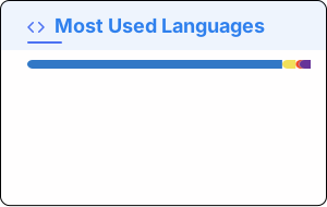
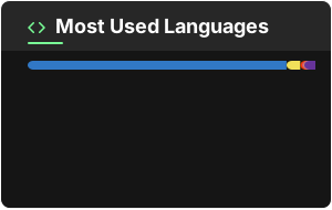
What that looks like:


Pinned repositories, two across
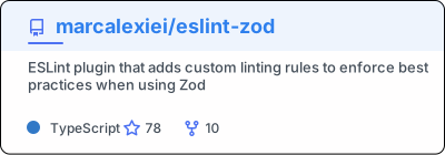
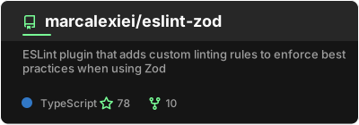
Section titled “Pinned repositories, two across”The same shape, one link per repository:
<a href="https://github.com/marcalexiei/eslint-zod"> <picture> <source srcset="./cards/eslint-zod-dark.svg" media="(prefers-color-scheme: dark)" /> <img align="center" src="./cards/eslint-zod-light.svg" alt="eslint-zod" /> </picture></a><a href="https://gist.github.com/marcalexiei/1f13e82cb48a9058ebcbf4945f5a1c20"> <picture> <source srcset="./cards/gist-dark.svg" media="(prefers-color-scheme: dark)" /> <img align="center" src="./cards/gist-light.svg" alt="A gist" /> </picture></a>Pin cards are already one height, so they need no height of their own.


Centring a single card
Section titled “Centring a single card”align="center" floats; it does not centre. For one card in the middle of a README, the wrapper
has to do it:
<div align="center"> <img src="./cards/stats-light.svg" alt="My GitHub stats" /></div><div align="center"> is deprecated HTML everywhere except here — GitHub keeps it, and it is the
only centring that works in a README.
When it still wraps
Section titled “When it still wraps”Two cards fall onto separate lines when they are wider than the browser window, which is narrower
than you think on a phone and inside GitHub’s own sidebars. If that matters, render both narrower
with card_width, or accept the wrap: it is the layout degrading, not breaking.
See In a README for where the files live and how to keep them current.