
Light and dark mode
A card is drawn with fixed colours, so a card that suits a light README looks wrong in a dark one. There are five ways around that. They are not equivalent — the first is the one to reach for, and the rest exist for the cases it does not cover.
GitHub’s media feature
Section titled “GitHub’s media feature”GitHub picks between images in a <picture> element
using prefers-color-scheme. Render the card twice, once per theme, and let the browser
choose:
<picture> <source srcset="./cards/stats-dark.svg" media="(prefers-color-scheme: dark)" /> <!-- light mode --> <img src="./cards/stats-light.svg" alt="My GitHub stats" /></picture>This is the recommendation. Each file is a plain card with nothing clever in it, the choice
happens before anything is fetched, and it is the approach GitHub documents.
Only the <img> takes the alt — it is what a screen reader announces.
This site is built the same way: every card on it is two files, which is why they all change when you switch the theme in the header.
Both modes in one card
Section titled “Both modes in one card”theme_light and theme_dark, and the *_light / *_dark colour params, put both palettes in a
single card. The card carries a stylesheet that follows the viewer’s setting, so there is one file
and one URL:
rendered from options that name both:
{ "card": "stats", "options": { "username": "octocat", "theme_light": "light_github", "theme_dark": "dark_github" }}The advantage is that it is not GitHub-specific: one file works in a README, on a sponsors page,
in a blog post, anywhere an image goes — including the places <picture> is stripped.
What wins over what
Section titled “What wins over what”Two stages. The first decides how many palettes the card carries; the second fills each one in.
1 · How many palettes the card carries
- No
*_light/*_darkamong the params — one palette. The card has no dark-mode block at all. - At least one of them — two palettes, each resolved on its own:
- light ← the params, with
*_lighton top - dark ← the params, with
*_darkon top
- light ← the params, with
2 · How each colour in a palette is filled in
Each colour takes the first of:
- the colour param you passed —
title_color,bg_color, … - the named theme’s colour —
theme_light/theme_dark, elsetheme - the default theme’s colour
border_color ends differently. When neither you nor the theme names one, it is derived from the
background: a light background gets a dark hairline, a dark one a light hairline, and anything
under 50% opacity a neutral one, since the page behind decides.
Written out, lowest to highest:
- the default theme
themetheme_light/theme_dark- a general colour param —
title_color,bg_color, … - the matching
*_light/*_darkcolour param
So the two can be mixed: a light and a dark theme, with one colour pinned across both.
{ "theme_light": "light_github", "theme_dark": "dark_github", "title_color": "aabbcc"}Anything a mode does not override falls back to the general params, so bg_color_dark on its own
changes one colour in dark mode and leaves every other colour as the base theme drew it.
And if no _light or _dark param is given at all, the card carries no dark-mode block — it is a
single-palette card, exactly as before.
GitHub’s theme context tag
Section titled “GitHub’s theme context tag”Appending
#gh-dark-mode-only or #gh-light-mode-only
to an image shows it only on that GitHub mode:
Unlike the media feature, this follows the GitHub setting rather than the browser’s. It is the
older mechanism, both images are fetched, and screen readers meet the same card twice —
prefer <picture> unless you specifically need the GitHub theme.
The transparent theme
Section titled “The transparent theme”transparent has no background at all, so one card sits on either mode:
rendered with "theme": "transparent".
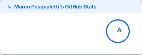
One file, no switching, and nothing GitHub-specific — at the cost of the palette being chosen for you. The text colours have to read against both backgrounds, which is what makes this theme look washed out against a strong one.
An alpha channel on any theme
Section titled “An alpha channel on any theme”A bg_color with eight hex digits carries alpha, and 00000000 is fully see-through. That turns
any of the 79 themes transparent while keeping its text and icon colours:
rendered with "theme": "tokyonight", "bg_color": "00000000".
This is the escape hatch when transparent’s own colours are not the ones you want. The border is
handled for you: a background under 50% opacity gets a neutral translucent border rather than the
light or dark one the card would otherwise pick, since the page behind it decides the contrast.
Which to use
Section titled “Which to use”| Situation | Reach for |
|---|---|
| A README, and you can commit two files | <picture> |
| One file that has to work anywhere | theme_light / theme_dark |
| It must follow the GitHub setting, not the OS | #gh-dark-mode-only |
| You want no background at all | transparent, or bg_color=00000000 |